Product Design, UX, UI
Tire Tutor
Product Manager - Paul Wanless
Service writers created estimates 30% faster
Higher confidence in pricing accuracy
Tire Tutor—at the time an e-commerce tire marketplace—was looking to build a product to address shop management frictions in the auto service industry.
Many independent and mid-sized shops still relied on outdated, disconnected tools—spreadsheets, handwritten notes, phone calls, and separate supplier sites—causing workflow gaps, communication issues, and limited visibility into performance.

Early sketches and rough user flows helped us visualize how the experience could come together and identify top features to focus on for the MVP.
After analyzing insights from our research, we set our North Star metric—% of repair orders completed without workflow interruptions. Measuring the percentage of repair orders that moved smoothly from check-in to payment gave us insight into how each persona was progressing through the workflow and ultimately getting value from our product.


A shop management platform designed to streamline auto shop operations by unifying the repair workflow, reducing manual processes and communication gaps, while providing real-time visibility for both shops and customers.
Improve transparency & communication
Reduce manual effort
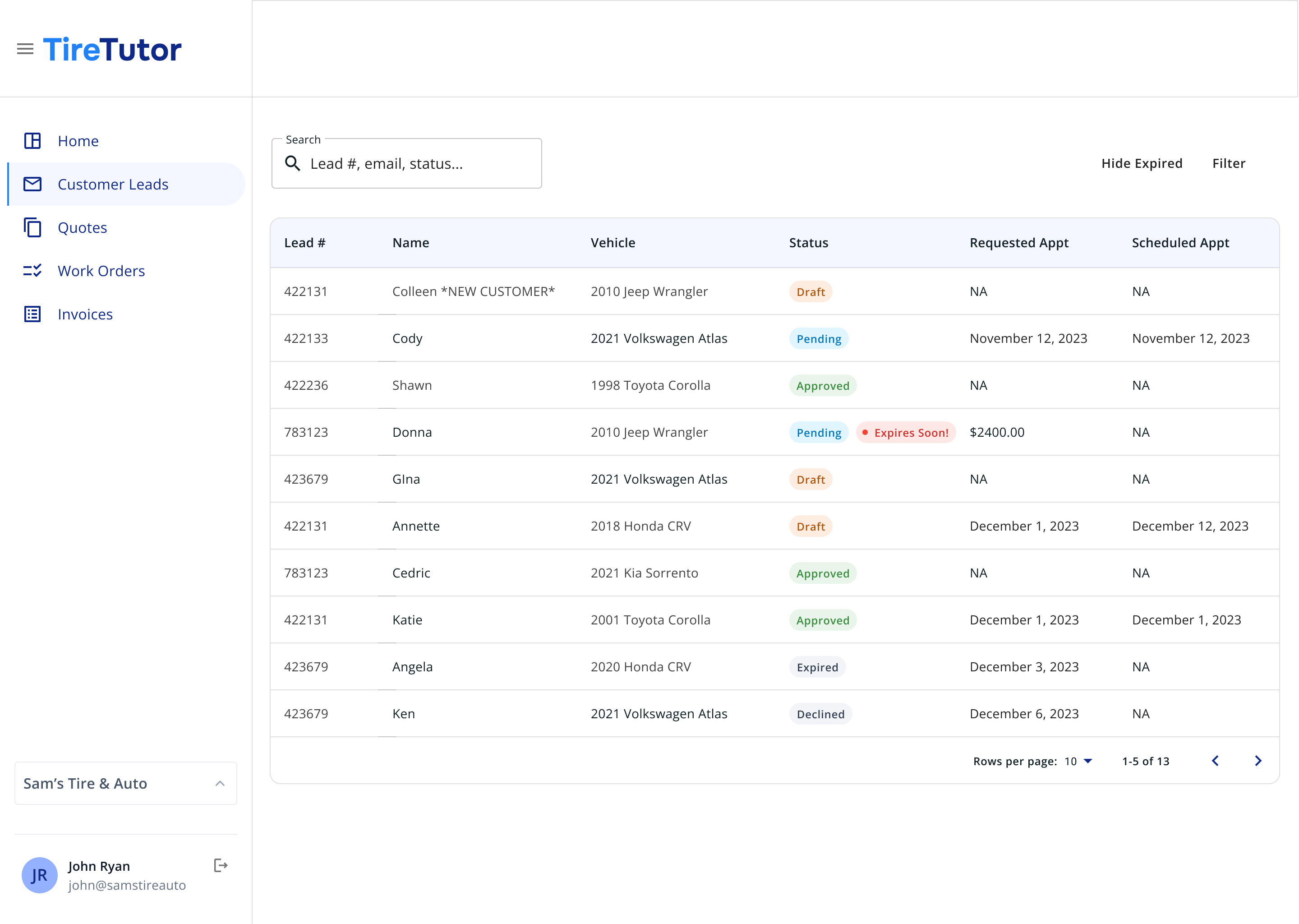
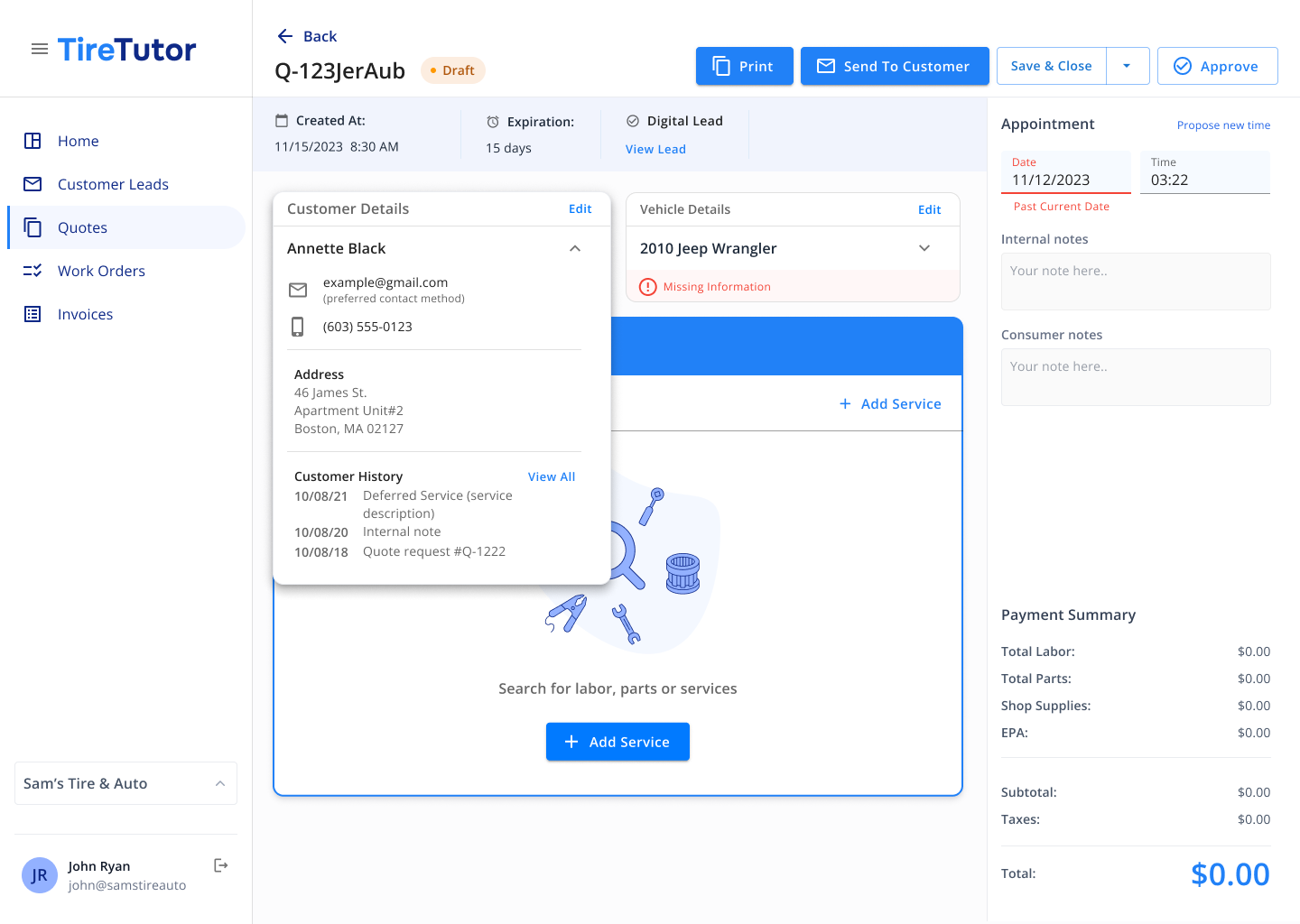
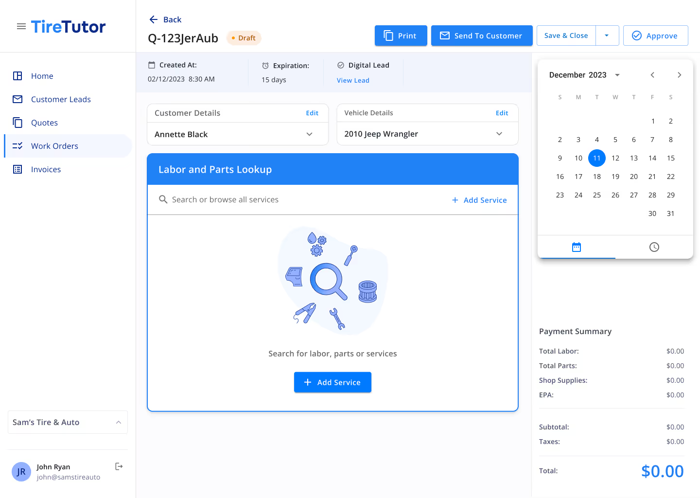
Simplify work order creation
%20-%20open.avif)

%20-%20open.avif)
%20-%20open-1.avif)

Service writers created estimates 30% faster
Higher confidence in pricing accuracy
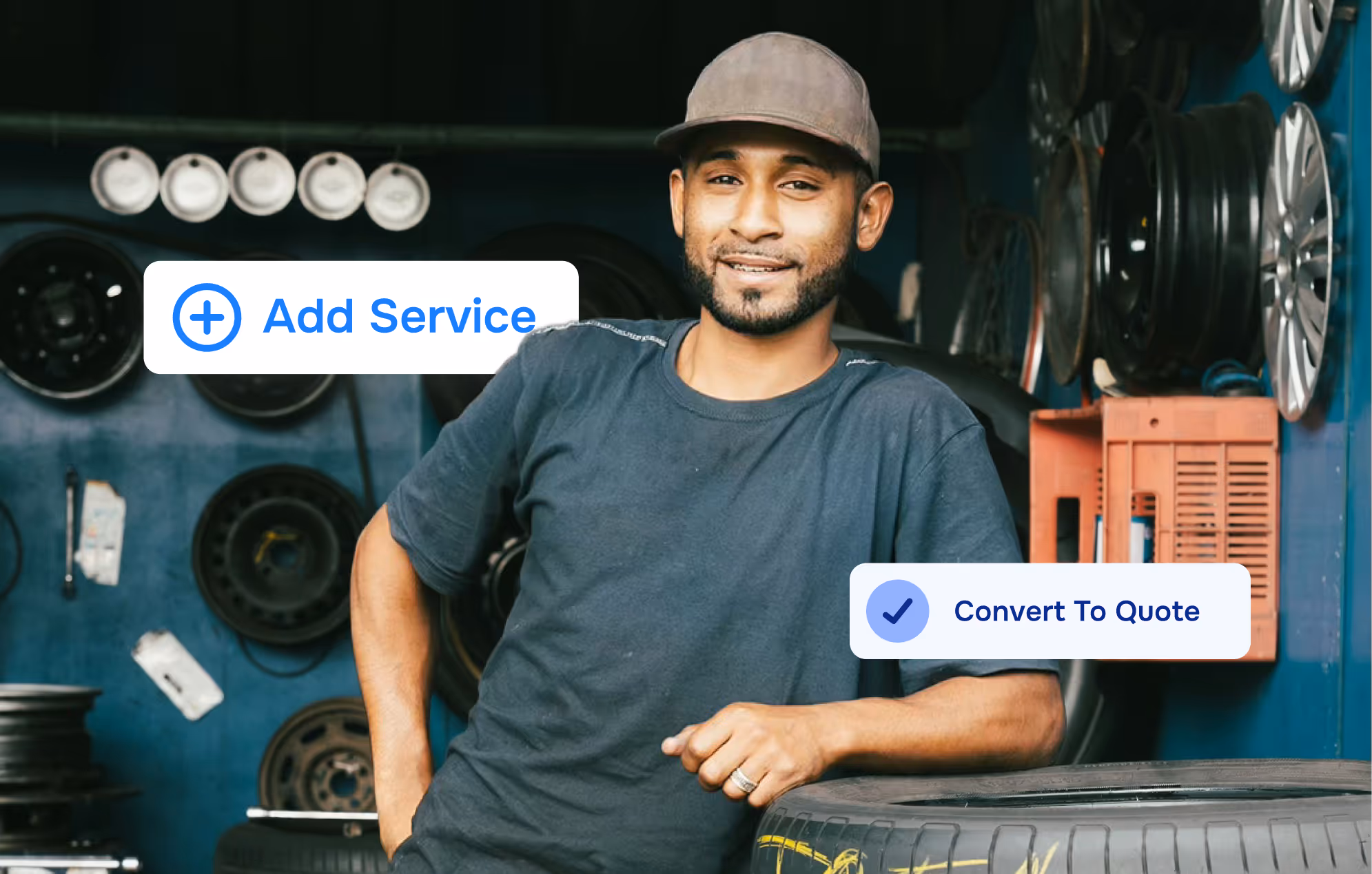
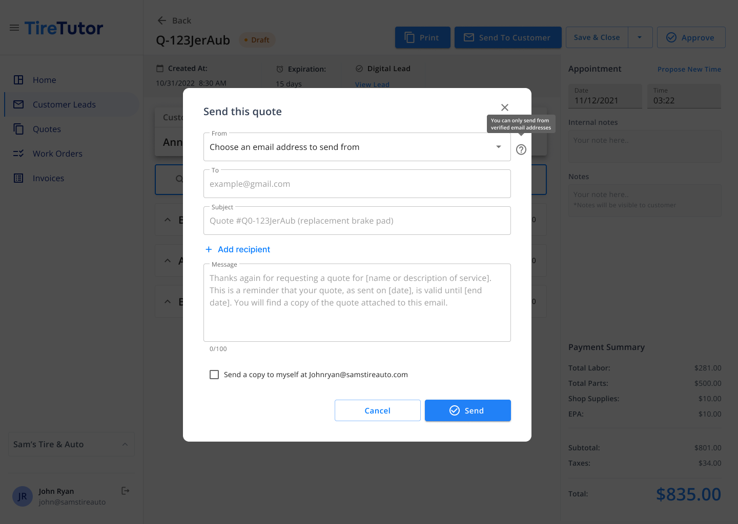
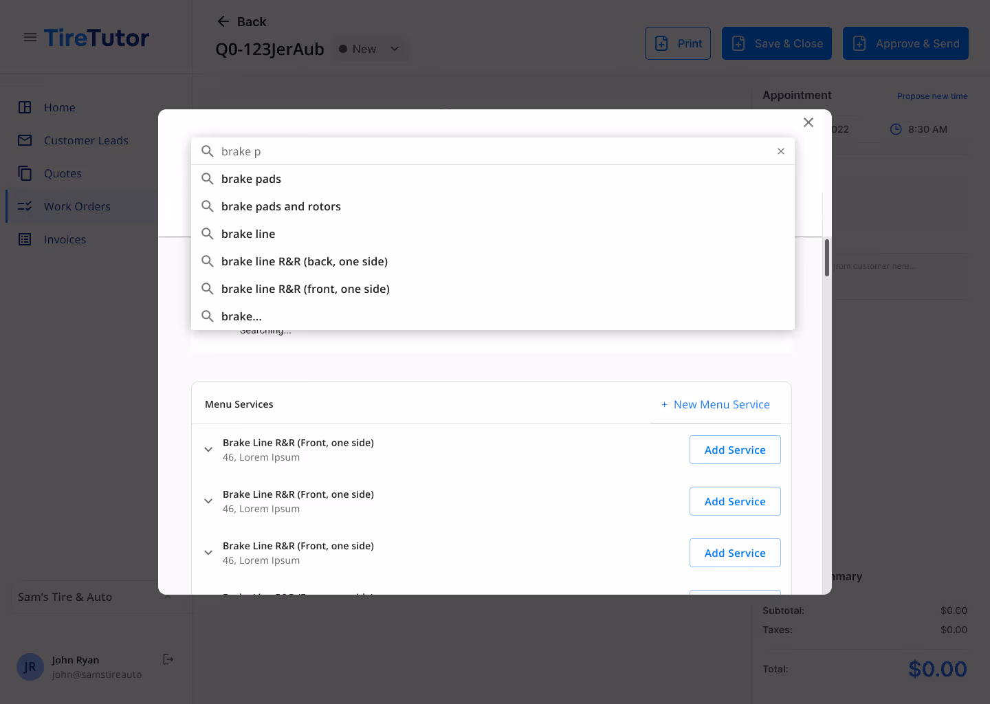
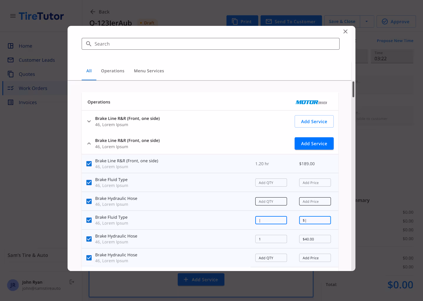
Early prototype testing revealed friction points around communication. Users wanted unique views for customer and tech notes, with the concern that customer-facing communications would confuse techs if visible in a quote or work order. We iterated based on this feedback and defined internal and external note sections that were only visible to the intended audience.
Follow-up testing showed significant improvements: service writers reported faster estimate completion and higher confidence in pricing accuracy. These sessions also uncovered an unexpected pain point—how to integrate phone-based orders and capture all funnel data in one view—which we added to the backlog for post-MVP.
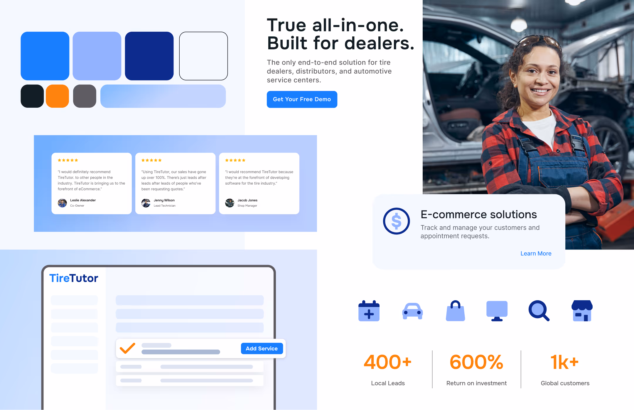
One challenge we faced with the UI was the lack of any defined brand or design principles. As a tech-led organization, brand had not been a high priority up to this point. We were leveraging Material UI, and outside of two defined brand colors (blue and orange—with the orange not being ADA compliant), there wasn't much room to build out a comprehensive UI.
I made a pitch to do a slight brand treatment to provide a starting point to inform things like secondary button colors, state handling, and the consumer-facing websites they were building out for other products outside of the CRM/POS.