General parts company

More than parts—building a design system to last

Genuine Parts Company, a major US-based automotive parts platform, was in the middle of a digital transformation. They were looking to overhaul their outdated (and under-resourced) design system to unify fragmented product experiences, shift from customer service based orders to online transactions, and scale their digital operations efficiently.

role

Product Design Lead, UX, UI, Systems Design

Agency

Rangle.io

Team

Design Director - Filip Mroz
Delivery Manager - Felipe De Oliveira
Technical Director - Jason Santos

The Problem

Like many large legacy organizations, GPC had accumulated years of inconsistent experiences across their platforms and acquired products. They needed to refactor and enhance their outdated design system, to improve design and UX consistency, reduce development costs, and increase speed-to-market. They also had a very small, under-resourced design system team that needed help.

Research & Discovery

Stakeholder Interviews

We started by talking to stakeholders across GPC to understand what was driving the need for a design system and where the biggest pain points were. These conversations revealed a common frustration: teams were duplicating effort, and the lack of consistency and a central source of truth was slowing down development and creating fragmented customer experiences, with many customers calling in orders after unsuccessful attempts online.

Design Audit

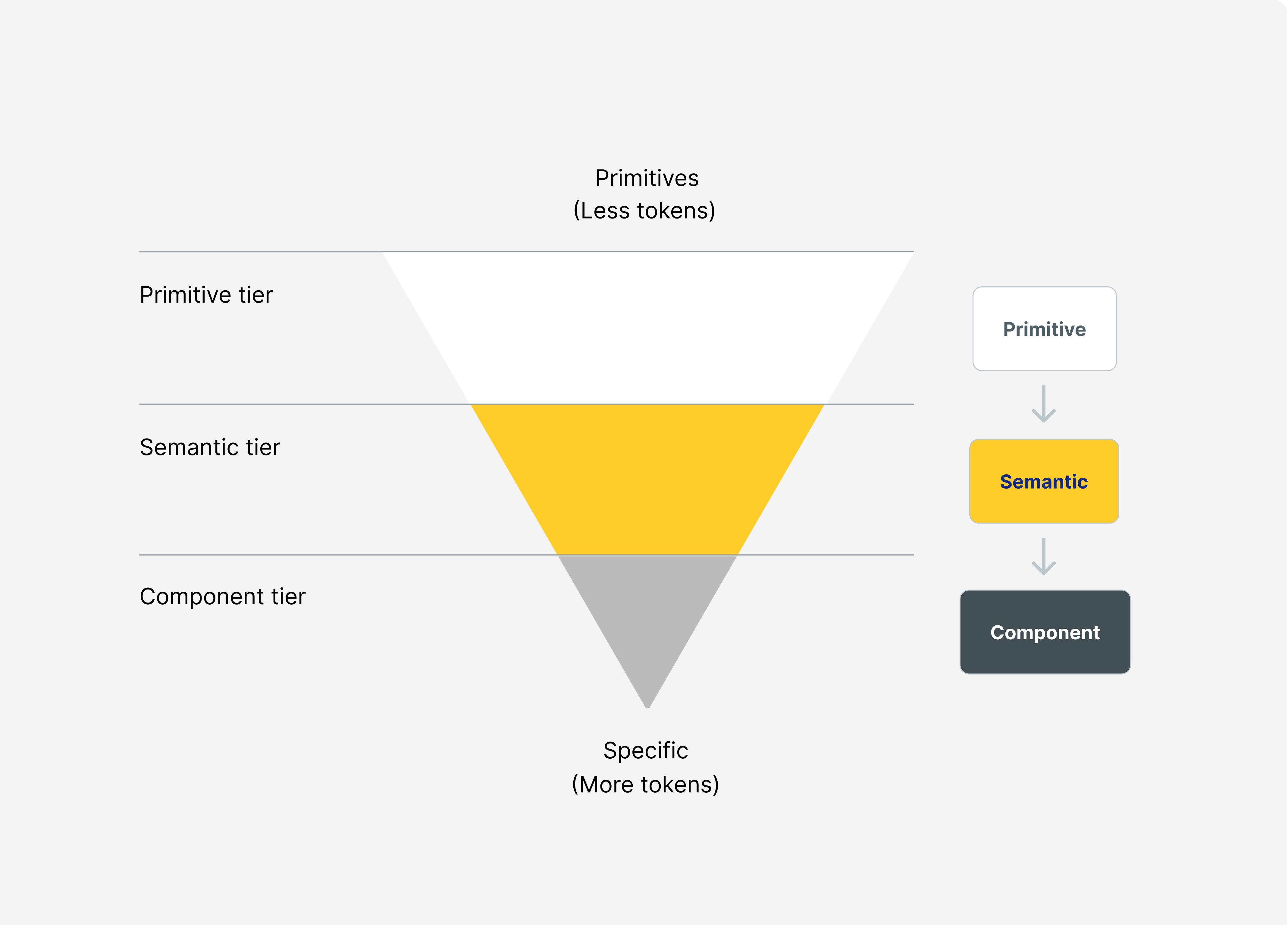
Through a comprehensive component and foundation audit, we discovered gaps and redundancies across the existing token structure, baseline accessibility issues, structural issues within existing components, and an incomplete component library. These issues were creating friction with consuming designers, and preventing  effective use  of the design system.

Our North Star

From these findings, we defined our North Star metric. Because adoption is how we measure value for our user (product team designers) and we didn't want to baseline against vanity metrics (i.e. number of components available) we landed on the % of Design System components in production per product, we then defined the select inputs we would measure, and how we would track progress (using our open-source internal tool Radius Tracker).

The Solution

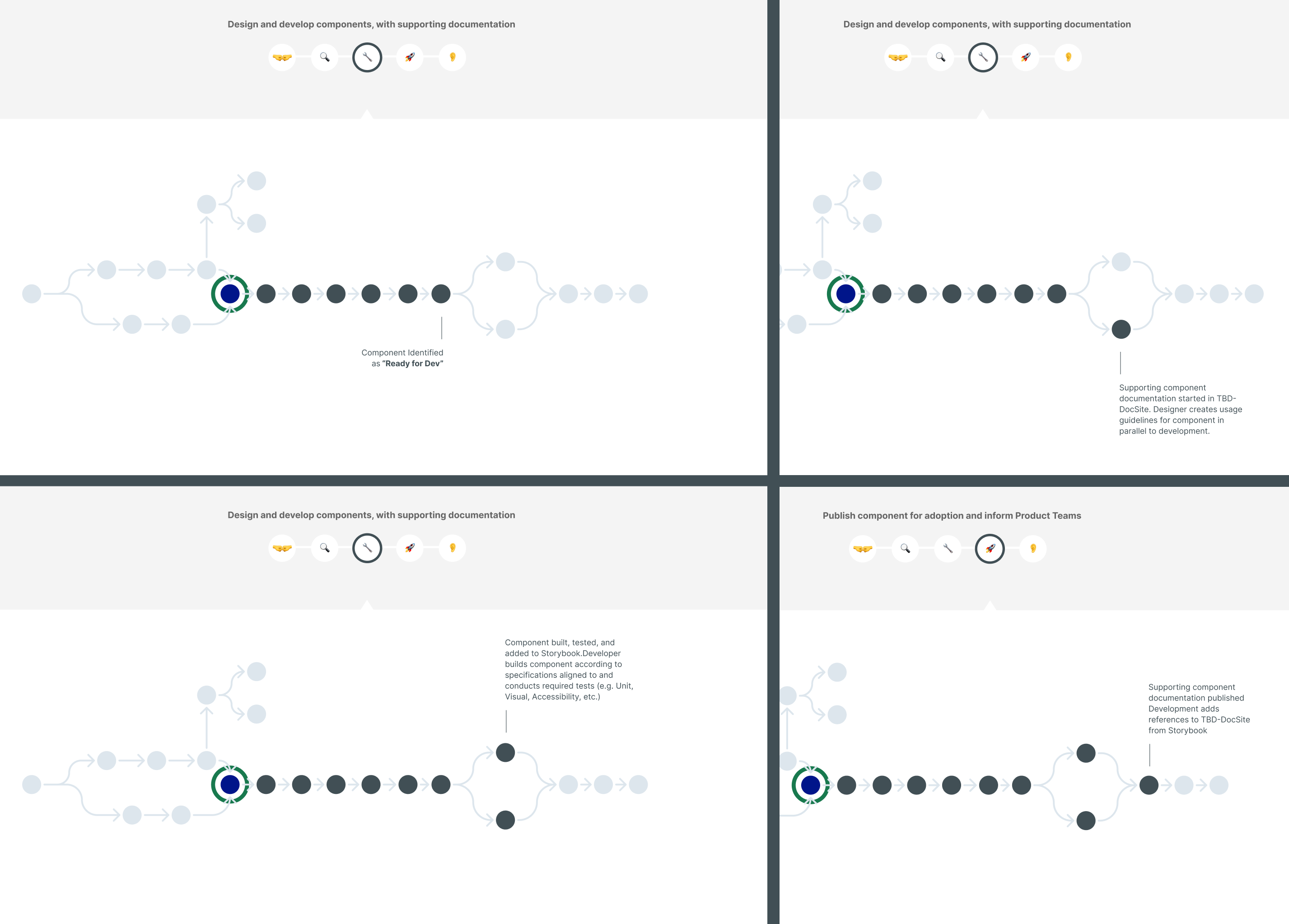
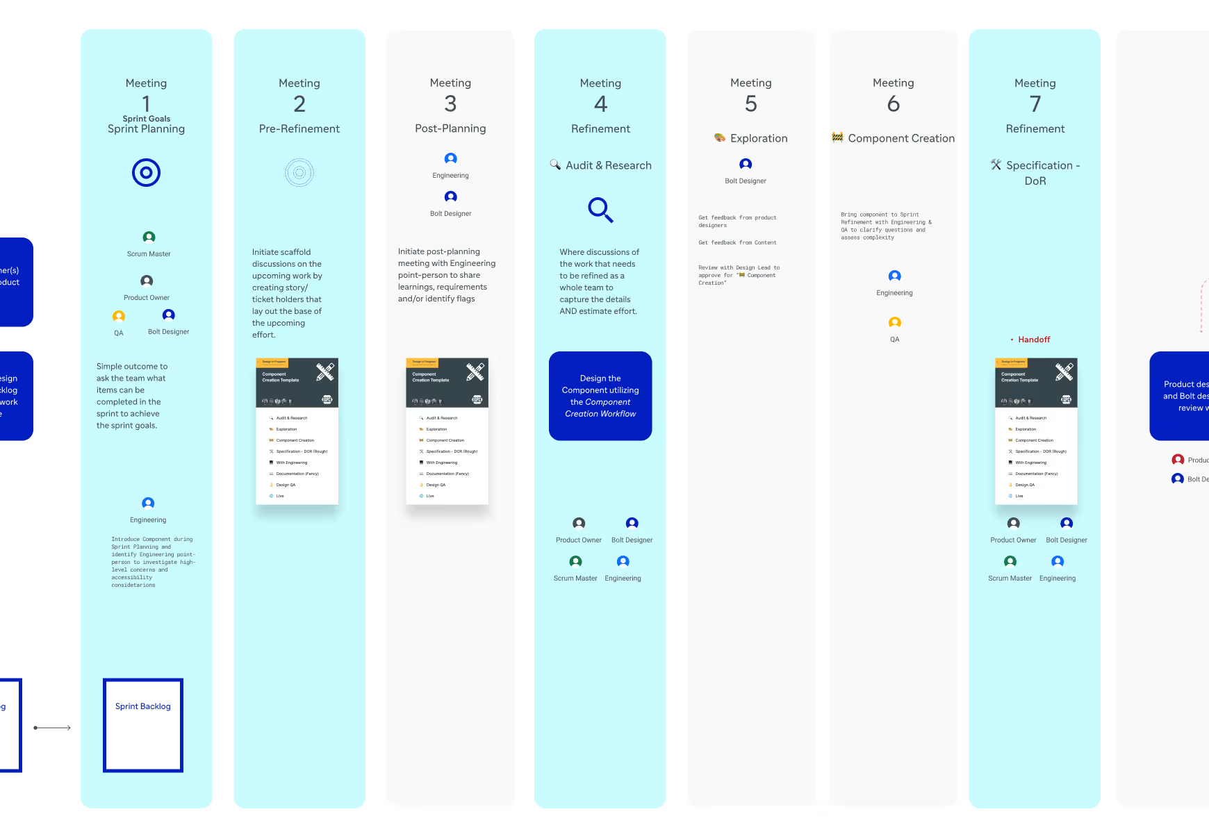
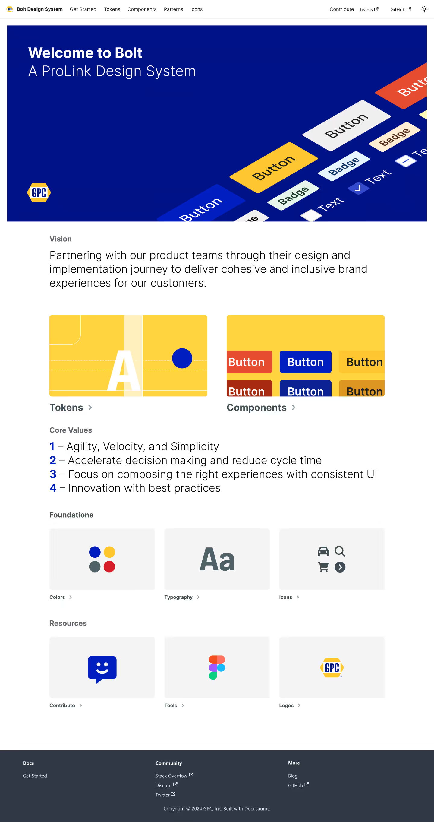
GPC didn't just need a component library—they needed a complete system with the right infrastructure, foundations, governance, documentation, and an adoption plan to actually work. We partnered with their internal team to build a design system that could unify their fragmented experiences and set them up for long-term success.

The Results

95% Coverage in the first 6 months

Adopted by 5 teams and counting

Governance & Contribution

We established a governance model that balanced control with flexibility, defining who could contribute, how decisions would be made, and what standards the components needed to meet before being added to the system.

The goal wasn't to create bureaucracy—it was to ensure the system could evolve with GPC's needs while maintaining consistency and quality across all products.

Token Structure

Leveraging Figma's variables and modes, we based our token structure on a three-tier architecture model—a combination of primitive, semantic, and component tokens that all map to their respective predecessor. Because we were building on an existing system, we focused our energy on cleaning up semantics, linking them to intention groups (forms, actions etc.) and documenting taxonomy patterns so they could be effectively understood and scaled by future teams.

The key challenge at this level was balancing breadth and specificity—tokens needed to be flexible enough to cover multiple use cases while remaining clear enough that teams immediately understood their intended purpose.

Component Creation

We identified and prioritized components that consuming product teams needed within the next 1-2 months (based on product roadmaps) and had complexity patterns likely to be shared across multiple products, then got building.We leveraged ShadCN (a headless component library) to quickly establish visual consistency and ensure base accessibility was met.

We researched each component individually—analyzing product usage, conducting competitor audits, testing, and exploration—and delivered thorough handoffs that outlined behavior and accessibility requirements to the development team.

DOcumentation

We built a comprehensive documentation site (Docusaurus) that went beyond just showing components—it explained when and why to use them, provided clear code examples, included guidelines for accessibility and best practices, and clear indicators of updates and items in the backlog.

More work

UX/UI

KFC

product design

tire tutor